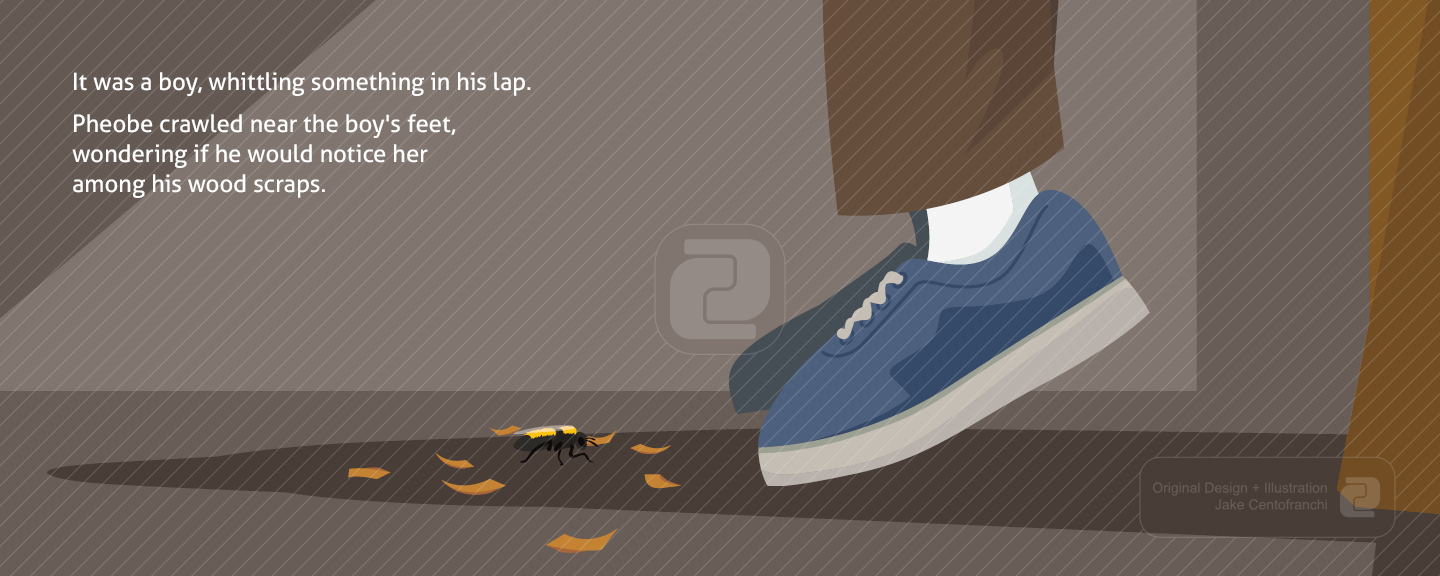
The Boy and the Bee
This book is designed with full page illustrations that bleed off the page. The illustrations in the book have a simple style that combine elements of geometic and organic shapes with a bright color palette. Pheobe was given a rather realistic bee look, as opposed to the usual cartoon style to help children gain a friendly association with an otherwise scary insect. There are no page numbers or chapter openings due to the simple nature and audience of this book. The type for the story is either Black text over light illustrations or White text over dark illustrations.

Here are the first few spreads from a children's book I wrote and illustrated while in school. This project was a lot of fun. I really enjoyed working in a simple vector style where simple flat shapes and bright youthful colors make up the composition.
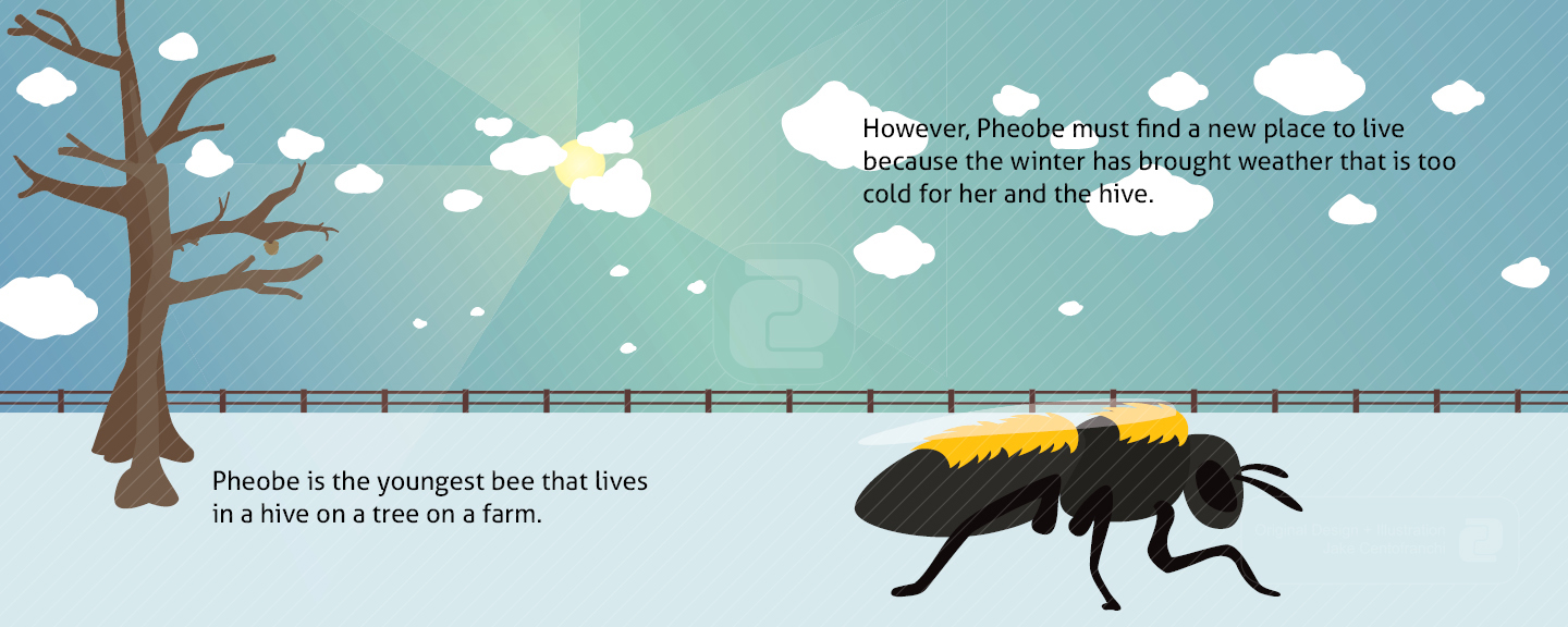
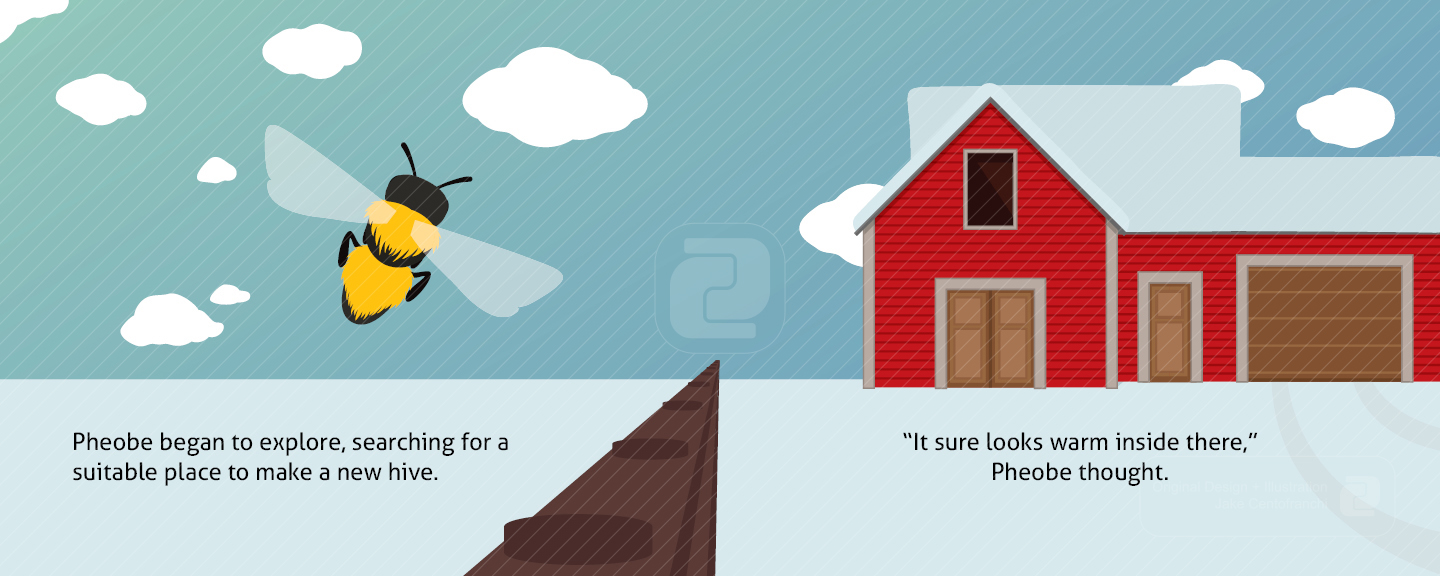
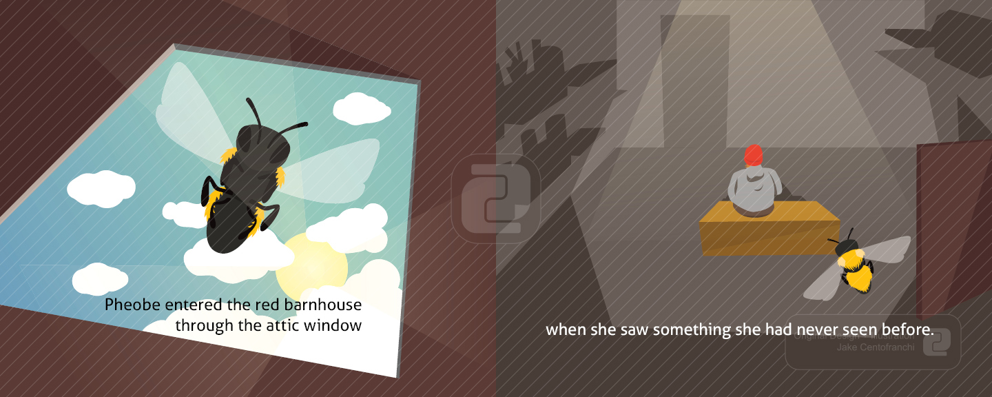
This book is intended for audiences of a very young age and aims to send a positive message about mother’s and how far they will go to look after their children. The story follows a newborn queen bee, Pheobe, as she raises a new hive for her pending family with unlikely help from a young human boy.

The second, but equally important moral divulged through Pheobe's tale is that bees and insects really are not so scary and that it is possible for humans to exist harmoneously beside all of nature's inhabitants. Respect them and they will respect you in return.

I used a pretty simple grid to lay out the type for this book: A five column grid with 1" margins all around. This wide margin gives the illustration room to play around the text. I kept this grid throughout the book for simplicty and continuity.